Was this forwarded to you by a friend? Sign up, and get your own copy of the news that matters sent to your inbox every week. Sign up for the On EdTech newsletter. Interested in additional analysis? Try with our 30-day free trial and Upgrade to the On EdTech+ newsletter.
Now that the US House has passed its version of the One Big Beautiful Bill (OBBB) through reconciliation and sent it to the US Senate, I think it would be interesting to visualize the estimated impact of the new risk-sharing accountability measures. In a nutshell, the draft bill proposes to put colleges and universities partially on the hook to reimburse federal financial aid loans that are unpaid each year, hence “risk-sharing”. The proposal adds a carrot to this stick through new Promise Grants that are formula-based and designed to encourage lower tuition and increased completion rates and higher earnings in the workforce.
This proposal takes the concepts behind the Financial Value Transparency (FVT) & Gainful Employment (GE) regulations to a new level.
What has been challenging is to decipher the complex formulas and use publicly-available data (e.g., the College Scorecard, IPEDS) to estimate the impact of this proposal on colleges and universities. Unfortunately, that is a very difficult question due to incomplete and contradictory data sets, but I’ll save that minutiae for a different post.
The US House of Representatives’ Committee on Education & Workforce (CEW) released a data set last year that provides its estimates on annual impacts per program and per institution. For this first post looking into the data, I have combined the CEW data with the College Scorecard and IPEDS, but I use CEW data for all of the actual impact estimates (i.e., the dollar amounts of risk-sharing reimbursements and the amount of Promise Grants). Please note that there is no good data dictionary to answer questions such as what year each metric is from, etc.
There is a lot to unpack, so let’s focus on one question: what is the net impact (combining risk-sharing and offsetting grants) per year compared to the percentage of low-income students enrolled in each institution? For the low-income metric, I use the percentage of students in each institution that receive Pell Grants.
In the views below, I show the four primary degree-granting sectors: Public 4-year, Private 4-year, For profit 4-year, and Public 2-year (aka Community Colleges). In future posts I’ll look at other sectors.
Per Student View
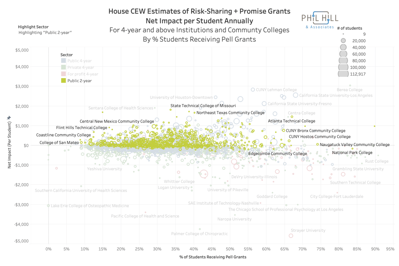
For the first view, we can look at the Net Impact (per Student) metric in the CEW data.

Note that the majority of schools would see an annual net impact between -$1500 (negative means the school would lose money with this mechanism) and $1500 per student. From a very broad view, there is no overwhelming trend when viewed against the percentage of Pell students.
But there are definitely differences per sector, as seen when highlighting the Public 2-year sector.

That sector is a net winner in the risk-sharing mechanism, which is interesting as the American Association of Community Colleges (AACC) is dead set against the proposal. And the community colleges with more than half of students receiving Pell Grants would receive some of the biggest net benefits.
Per Institution View
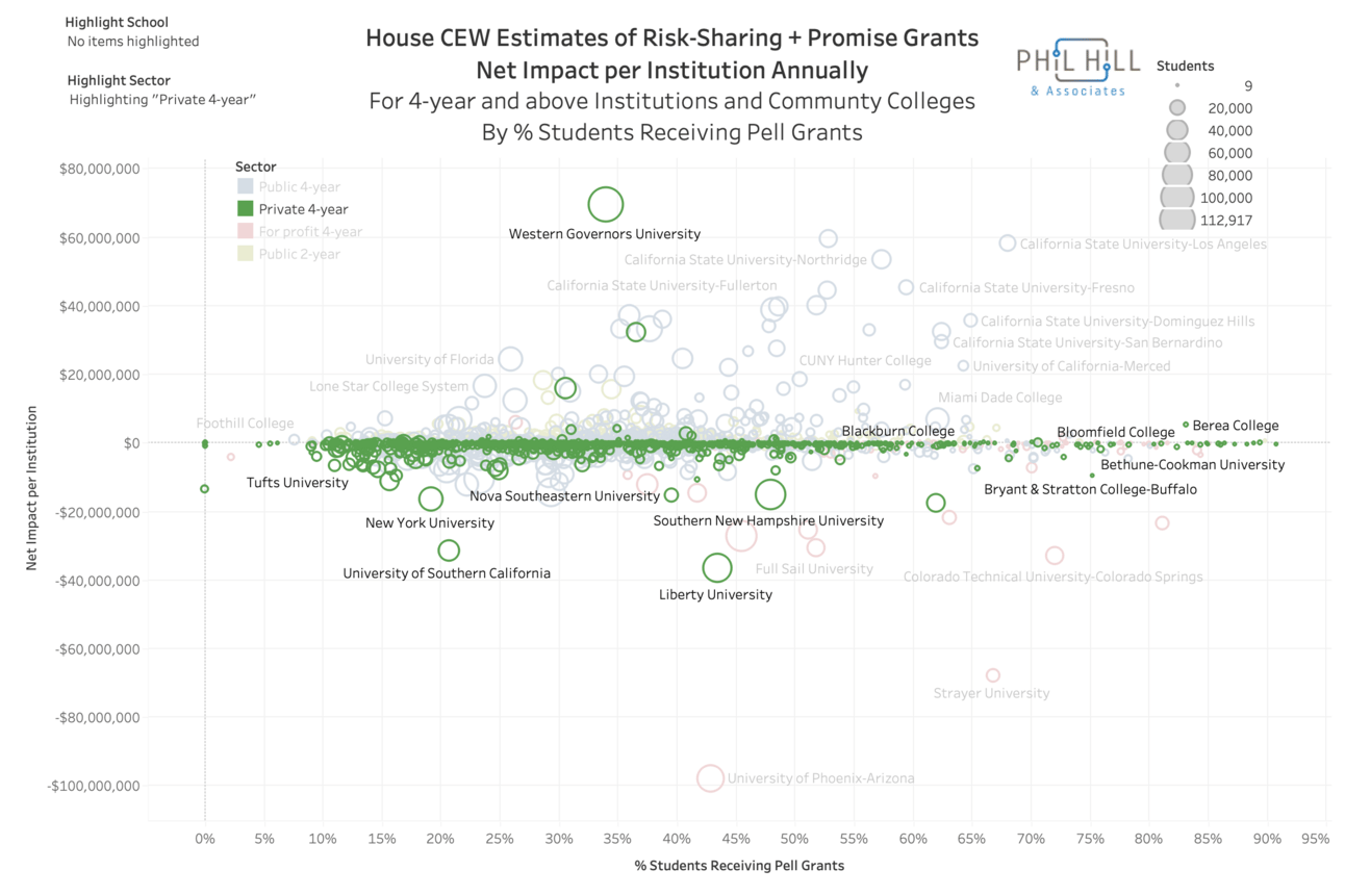
If we look instead at the Net Impact CEW metric that is per institution, we can see more of a total budget view.

Wow, Western Governors University (WGU) is looking pretty good here. The majority of institutions will range from losing $40 million annually to gaining $40 million. And there are quite a few institutions with large online populations (ASU, Grand Canyon, Capella, Liberty, University of Phoenix, DeVry, Strayer) among the biggest losers.
In the example of Michigan State University (MSU), with 22% of its students receiving Pell Grants, its net impact is estimated as roughly -$12 million (losing out with this proposal).

Let’s highlight the three 4-year groups.
Public 4-year

Another wow - the biggest winners seem to be from the Cal State University and University of California systems. Some narratives are exploding there.
Private 4-year

Here, it’s interesting to see the divergent prospects of the big online institutions - WGU fairing far better than Southern New Hampshire University (SNHU) and Liberty University. In fact, WGU is predicted to have a positive net impact of $69 million annually. The other large private 4-years of the University of Southern California (USC) and New York University (NYU) are not that surprising with negative impacts, largely due to higher tuition levels.
For Profit 4-year

And continuing the narrative busting, the sector fairing the worst in the new risk-sharing proposal is For profit 4-year, particularly the University of Phoenix and Strayer University.
Pell Percentage
I did not intend to do a full statistical analysis of the question of net impact versus percentage of low-income students. But from first glance, institutional sectors seem to play a bigger deterministic role, at least for the center majority of institutions. There are variations at the margins (e.g., at schools with more than 80% students receiving Pell Grants) but no immediately obvious relationship.
I’ll keep digging into the data and making attempts to reconcile CEW estimates with independent estimations directly off of the College Scorecard and IPEDS and other public data sources. And I’ll look at other sectors. Stay tuned.
The main On EdTech newsletter is free to share in part or in whole. All we ask is attribution.
Thanks for being a subscriber.

